Breakout Container
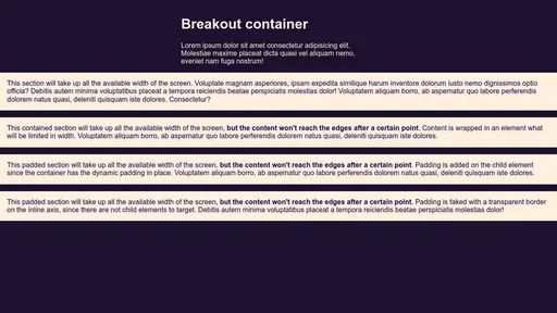
Here's a quick tip if you have your content limited to a certain width but you want an element to "break out".
I've seen a few ways to do this, including one with transform which works great, but I ran into a case where I needed that transform for some animation. You can instead make use of relative positioning to achieve the same result.
Say you have a .container class with a max-width value and margin: 0 auto:
.container {
	max-width: 48em;
	margin: 0 auto;
}
You can break an element out of this container by making it take up the whole screen's width (100vw), then move it left by 50% of the container (which is the middle of the screen), minus half the screen's width (50vw), effectively placing it on the very first horizontal pixel of the viewport.
.breakout {
	position: relative;
	left: calc(50% - 50vw);
	width: 100vw;
}
That's all you need for this trick to work. However, you might want to improve this a bit, so let's go a bit further.
Improvements
You should also add overflow-x: hidden to the body (or a main wrapper around your container that takes up 100% of the width) to help with breakout elements that might eat up extra space for the vertical scrollbar on some browsers/operating systems.
.main {
	overflow-x: hidden;
	width: 100%;
}
Note that if you want to really push the backward compatibility, in order to avoid a broken layout for the few browsers that support the vw unit but not calc(), you can use any variation of calc(50vw * 2) that results in 100vw. This will ensure older browsers won't have content outside the viewport.
As a bonus, if you want to avoid having an absurdly large content on an ultra-wide viewport, you can restrict the max-width with two methods.
First method: Container
This method involves wrapping the content in an element. Doing this will allow us to assign a maximum width and horizontally align the block in the middle:
<div class="container">
	<div class="breakout">
		<div class="breakout--content">Centred content goes here…</div>
	</div>
</div>.breakout--content {
max-width: 80em;
margin: 0 auto;
}Second method: Dynamic Padding
This calc value will take the screen width (100vw) minus the maximum width of the content you give it (let's say 80em) and divide the result by 2. The block will still take up all the horizontal space but the content will remain at a reasonable width.
If the screen width is equal to 80em, the padding will compute to 0, but if 100vw is worth 100em, the padding will evaluate to (100em - 80em) / 2 = 10em on each side. Note that box-sizing: border-box; is necessary to ensure the padding is subtracted from the full viewport width instead of added to it.
* {
	box-sizing: border-box;
}

.breakout--contained {
	padding-inline: calc((100vw - 80em) / 2);
	/* Logical property, equivalent to setting this value to padding-left and padding-right in left-to-right contexts */
}
Note
A media query is not necessary since negative padding values are invalid. 👍
Let's have a look at the complete code all together now: