A Future of Themes with CSS Container Style Queries
Table of Contents
You may already know this, but I have a slight bias towards theming “efficiently” (or ridiculously) in CSS with custom properties, as I wrote about in 2021. It’s a fun technique (and hacky as hell), but we’re now getting ready for container style queries. These kinds of queries let us check the value of a custom property for a container, and apply styles to elements inside the container accordingly.
Una already wrote a great introduction to this feature as a demo on how this can be applied to components, and even themes. If you have never played with container style queries, I highly recommend having a look at the article before reading further here. As Una shows, you can style based on a theme property, but how would we go about actually implementing that idea on a site-wide scale? We’ll take a look at this from a “multi-theme” perspective, though this works fine for a binary light/dark mode theme setup.
Still Experimental
Please note that this is an experimental feature which has not yet landed in stable browsers at the time of writing, so you’ll likely want to test it out in Chrome Canary, or regular Chrome might even work these days!
First off, let’s take a look at a demo where you can cycle through a theme value that affects the entire layout:
We want to define our custom properties once for each theme, and then access them as we would any other custom property. But to spice things up, we’ll also ensure we have a set of sensible defaults. These defaults will have two roles:
- Ensure that themes without the property explicitly defined still behave as expected
- Act as an “unskinned” version of the site if the browser does not support container style queries at all (though we’ll also take a look at pulling in one theme as a default)
With the ability to style an element based on its container’s style, we can query the root element (<html>, which acts as our default container so there is no need to explicitly assign a container property on it) and style the <body> element, for example:
@container style(--theme: dark) {
	body {
		--color: ghostwhite;
		--background: midnightblue;
	}
}
“But wait a minute,” I hear you say, “can’t we already do this by applying the custom properties on the root without containers?” And, yes, that is true! That’s how I’ve built my website’s theme feature, which works in all current browsers, but it does require more work to set up properly (not to mention a pretty terrible hack). The style query approach is more of an experiment about how we might do the same in a cleaner way.
A note on specificity
Before we take a look at our current and future options, I’d like to make sure the pattern below (which is present in every option) doesn’t cause any confusion.
html:where(:not([data-theme])), /* 0,0,1 or 0,1,1 without :where() */
:root[data-theme=light] { /* 0,2,0 */
	/* "light mode" stuff */
}

@media (prefers-color-scheme: dark) {
	html:where(:not([data-theme])) { /* 0,0,1 or 0,1,1 without :where() */
		/* "dark mode" stuff */
	}
}

/* Explicitly set the properties for the selected theme */
:root[data-theme=dark] { /* 0,2,0 */
	/* "dark mode" stuff */
}
The html and :root selectors target the same element in the context of a standard web page: <html>, however the former is an element selector with a specificity score of 0,0,1, whereas the latter is a pseudo-class selector with a score of 0,1,0. We’ll use that to our advantage for our overrides.
Wait a tick… html:not([data-theme]) has a score of 0,1,1, which is still safe to use compared to the data-attribute being defined with :root[data-theme=dark] and its score of 0,2,0, so why wrap the data-attribute inside :where() (which returns a score of 0,0,0 for its target)?
Okay, you got me: there’s no specific (hah!) reason besides me wanting a low score that makes other overrides and exceptions easier to implement. You can omit the :where() wrapper and you’ll likely get the exact same result. And honestly, I had been waiting to use :where() for so long that I now use it very liberally, which is a “me” problem!
Note
We'll be checking for two scenarios: missing data-attribute and user preferences, or a defined data-attribute (the override), as the former combination allows the styles to be displayed without JavaScript while respecting user preferences!
Current approach: write everything twice
/* No theme has been set, or override set to light mode */
html:where(:not([data-theme])),
:root[data-theme=light] {
	--color: black;
	--background: antiquewhite;
	/* … and all your other "variables" */
}

/* Apply dark mode if user preferences call for it, and if the user hasn't selected a theme override */
@media (prefers-color-scheme: dark) {
	html:where(:not([data-theme])) {
		--color: ghostwhite;
		--background: midnightblue;
		/* … and all your other "variables" */
	}
}

/* Explicitly set the properties for the selected theme */
:root[data-theme=dark] {
	--color: ghostwhite;
	--background: midnightblue;
	/* … and all your other "variables" */
}
Pros: Very little complexity and no surprises, what you see is what you get.
Cons: The dark mode theme properties are duplicated.
As you can see the dark theme is repeated, which is not great. That’s why I came up with the space toggle approach from my article, and as a quick summary, here’s an example below.
Current approach: don’t repeat yourself
/* Set up the initial state and our "boolean" flags, with low specificity */
html {
	/* Space toggle, h/t Lea Verou */
	--OFF: ;
	--ON: initial;
	/* Set all themes to be OFF initially */
	--theme-light: var(--OFF);
	--theme-dark: var(--OFF);
}

html:where(:not([data-theme])),
:root[data-theme=light] {
	--theme-light: var(--ON);
}

@media (prefers-color-scheme: dark) {
	html:where(:not([data-theme])) {
		--theme-light: var(--OFF);
		--theme-dark: var(--ON);
	}
}

:root[data-theme=dark] {

	--theme-light: var(--OFF);
	--theme-dark: var(--ON);
}

/* Sequence each theme value together */
:root {
	--color: var(--theme-light, black) var(--theme-dark, ghostwhite);
	--background: var(--theme-light, antiquewhite) var(--theme-dark, midnightblue);
	/* … and all your other "variables" */
}
Pros: Minimal repetition to declare the “active theme”.
Cons: Uses hacky tricks with a non-obvious pattern, sacrificing readability to prevent duplicated properties.
It does make the code more complex. I’d feel confident showing the former method to a beginner in CSS, but this one has tricks and hacks throughout, so in terms of readability and maintainability, it’s pretty bad. Abstracting it away in a pre-processor removes that layer of complexity, but I also believe that sweeping things under the rug is not a great approach, which is why I’ve used this on my personal site but nowhere near client projects.
So let’s see how we can make this cleaner with the style queries.
Future approach: clean and readable
/* Optionally, we can define the theme variable */
@property --theme {
	syntax: '<custom-ident>'; /* We could list all the themes separated by a pipe character but this will do! */
	inherits: true;
	initial-value: light;
}

/* Assign the --theme property accordingly */
html:where(:not([data-theme])),
:root[data-theme=light] {
	--theme: light;
}

@media (prefers-color-scheme: dark) {
	html:where(:not([data-theme])) {
		--theme: dark;
	}
}

:root[data-theme=dark] {
	--theme: dark;
}

/* Then assign the custom properties based on the active theme */
@container style(--theme: light) {
	body {
		--color: black;
		--background: antiquewhite;
		/* … and all your other "variables" */
	}
}

@container style(--theme: dark) {
	body {
		--color: ghostwhite;
		--background: midnightblue;
		/* … and all your other "variables" */
	}
}
Pros: Minimal repetition to declare the “active theme”.
Cons: There are no defaults, and theme-specific properties cannot be used if the browser doesn’t support style queries.
This is starting to look good! You can definitely implement this pattern and it’ll work as expected, if…
- the properties are properly defined in every theme,
- and the browser supports container style queries.
So let’s see how we can address these issues, and ensure we have defaults in place when a theme omits a particular property, allowing us to also show a somewhat simple but functional style on non-supporting browsers.
Future approach: with fallback
/* Same as before */
html:where(:not([data-theme])),
:root[data-theme=light] {
	--theme: light;
}

@media (prefers-color-scheme: dark) {
	html:where(:not([data-theme])) {
		--theme: dark;
	}
}

:root[data-theme=dark] {
	--theme: dark;
}

/* Nearly the same, except each property is prefixed with an underscore ("private" properties, another Lea Verou idea) */
@container style(--theme: light) {
	body {
		/* Notice that the --_color property has been omitted! */
		--_background: antiquewhite;
		/* … and all your other "variables" */
	}
}

@container style(--theme: dark) {
	body {
		--_color: ghostwhite;
		--_background: midnightblue;
		/* … and all your other "variables" */
	}
}

/* Consume the "private" properties, and expose "public" properties, with a guaranteed value thanks to the fallbacks */
body {
	--color: var(--_color, black);
	--background: var(--_background, white);
	/* … and all your other "variables" */
}
Pros: Omitted properties don’t cause the styles to appear broken as the fallbacks ensure a valid value is always present.
Cons: Basically creating an additional “unskinned theme” on top of “styled themes”.
That “con” is a bit of a pain, and in a way defeats the purpose of not repeating code by adding some (ideally) never-used theme, right? Not great, however… I’d like to shift that perspective a little bit, and consider instead that it represents our base theme, our house (I know, in this economy?!) before we add a coat of paint. It is unstyled, boring, and doesn’t look like much, but is fully functional nonetheless — a minimal viable theme, if you will. And your “skinned themes” can layer properties on top of it. You’d likely have font and colour properties declared in themes, whereas layout and spacing would be independent global-level values (at least in this scenario).
I find this to be very practical if you have 6 themes, for example, and 5 of them use the same font-family for the body text. Instead of defining that same font-family 5 times, you declare it once as your default fallback, and provide the “private” property for that one theme with another font.
JSON tokens to CSS
Nowadays, it is pretty common to consume a JSON file with design tokens for a website’s stylesheet, so with a little JSON-to-CSS magic, it could be automated with a “default” set of properties, and then one object per theme with the overrides. Let’s take a look at a simplified example:
{
	"default": {
		"color": "black",
		"background": "white",
		"font-body": "sans-serif",
		"font-heading": "var(--font-body)",
		"etc": "...and so on..."
	},
	"light": {
		"_USER_SCHEME": "light",
		"background": "antiquewhite"
	},
	"dark": {
		"_USER_SCHEME": "dark",
		"color": "ghostwhite",
		"background": "midnightblue"
	}
}
I don’t want to make this article any longer than it already is, so optionally, let’s write a “short” build-time tool in JavaScript (I’ll be using a Node.js environment) to convert this JSON to CSS. This can be plugged into an Eleventy asset pipeline or made into a gulp pipeline.
We’ve created our stylesheet and are now ready to use our themes! I’ve added a third theme in my demo, and created a quick script to set and toggle the override theme when you press a button. We end up with the result you saw at the start of this article, demonstrated as a live example below, if you browser supports style queries:
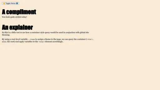
There are good articles on how to build a theme switcher (Lea Rosema, Max Böck, and Jason Lengstorf have great examples) so the main behaviour is to add a data-theme attribute to the <html> with a value matching the theme key. I didn’t add a localStorage feature for this demo but you’d definitely want that so the same theme applies across page navigations and repeat visits! The data-attribute has a higher specificity than our default html selector (not to mention :root!), so it will always override it — just what we’re after!
Caveats and issues
Light theme by default
We could bypass the style() query wrapped around the body for our light theme, for example, if we wanted to offer a styled theme in browsers without support for container style queries. But to ensure that browsers which do support it don’t apply it over the dark theme (in the case of having prefers-color-scheme: dark and not having an override), we can keep specificity at an all-time low with :where(body). This way, we don’t need to re-arrange our output order in the jsonTokensToCss function (as @media or @container query wrappers do not add any specificity). You could also, quite radically, make the light theme be the default theme with a few tweaks to the code above. I feel that’s a fairly common approach to light/dark mode, so why not for a collection of themes as well?
But a caveat to this caveat… this has a side-effect of not respecting a user’s preferred colour scheme, and that is why I don’t really like this approach. You can certainly do it! But I want to respect user settings, so instead, what you could do is set defaults with the browser’s user agent colours. Jim Nielsen (no relation!) has a neat article about this, and the spec for system colours lists what we’ll need: Canvas, CanvasText, LinkText, and all their friends (so our JSON file would have default.background = "Canvas" and default.color = "CanvasText"). Keep it simple and predictable and it should provide a graceful “unthemed” style!
And one final note on this, you could declare a @property with a default value instead, but that requires also specifying the syntax to use (color, length, or even *) — so it’s an option, but it’s more complex as you need a form of glossary for your tokens (which might be provided if you’re working with a bona fide design system) to describe their type… not to mention you need to describe every single property, which might make your stylesheet a little heavy if you need to declare this kind of stuff dozens of times:
@property --_color {
	syntax: '<color>';
	inherits: true;
	initial-value: CanvasText;
}
Background defined in the body
You may notice that doing this defines all our theme-specific properties into the <body> element, namely the --background custom property, which is then used to define the background property. If you don’t already know this, there is a legacy behaviour where the <body> element’s background gets propagated upwards to the html element. It’s not a best practice by any means, but it was defined like this decades ago, and on the web, we avoid breaking things, so this behaviour, while deprecated, will keep working for the foreseeable future. We can therefore take advantage of this and set the background colour on the <body> element to affect the <html> element. (we should still feel shame doing it, but it won’t stop us!)
Defining color-scheme
While the background property will propagate from body to html, color-scheme will not. Which is fair, after all it was introduced later and propagating the background is considered to be bad (not as sinful as z-index: 999999, don’t worry), so the CSS specification authors are avoiding it. And since properties cannot be propagated upwards, we’ll need to make an exception in our JSON-to-CSS script to accommodate for this. We’ll modify the JSON file so that each theme has a _colorScheme property (using a different kind of “private” key here with the underscore) with the correct light or dark value, which will ensure the scrollbars conform to the user’s operating system’s interface appearance:
{
	"default": {
		"color": "Canvas",
		"background": "CanvasText",
		"font-body": "sans-serif",
		"font-heading": "var(--font-body)",
	},
	"light": {
		"_USER_SCHEME": "light",
		"_colorScheme": "light",
		"background": "antiquewhite"
	},
	"dark": {
		"_USER_SCHEME": "dark",
		"_colorScheme": "dark",
		"color": "ghostwhite",
		"background": "midnightblue"
	},
	"pastel": {
		"_colorScheme": "light",
		"color": "maroon",
    "background": "lightpink"
	}
}
And update our (optional) JSON-to-CSS function:
	let output = `
		html:where(:not([data-theme])),
		:root[data-theme='${lightScheme}'] {
			--theme: ${lightScheme};
			color-scheme: ${tokens[lightScheme]._colorScheme};
		}

		@media (prefers-color-scheme: dark) {
			html:where(:not([data-theme])) {
				--theme: ${darkScheme};
				color-scheme: ${tokens[darkScheme]._colorScheme};
			}
		}

		:root[data-theme='${darkScheme}'] {
			--theme: ${darkScheme};
			color-scheme: ${tokens[darkScheme]._colorScheme};
		}
	`;

	// If any non-scheme themes are left to show, add them to the output
	for (let themeKey of nonSchemeThemes) {
		output = output.concat(`
			:root[data-theme='${themeKey}'] {
				--theme: ${themeKey};
				color-scheme: ${tokens[themeKey]._colorScheme};
			}
		`);
	}
I suppose we could hardcode light and dark for the scheme ones, since we know what they are, up to you! We could also throw background in there (without omitting --_background among the other tokens as we might want to access the custom property inside another element!), but that’ll start to be a bit much in terms of repetition, so this is a small CSS sin for the greater good of unrepeated code.
Today I learned
While writing this, I discovered that the color-scheme property, if set to a specific value (light or dark, instead of normal, light dark, or dark light), determines the actual colour used by those system colours we saw earlier. I thought it was only controlled by the media query! A (prefers-color-scheme: dark) media query around html using color-scheme: light will render in “light mode”! My website themes use color-scheme, so the CodePen demo for browsers without support will change based on the theme's dominant scheme! (well, only in Firefox, it seems) That’s so cool! But it also highlights why defining this property is important if we're overriding user preferences.
Conclusion
Okay so we’ve found a way to have our themes that respect our user’s preferences while allowing overrides, we have a decent baseline default experience, and we barely repeat any kind of code. Well, kind of. Close enough I guess?
Should you use this on a professional project? I don’t know. Probably not (yet). I mainly wanted to try out style queries on something I’m otherwise familiar with, and share a few fun tips… figured we might all learn something along the way. But if you wanted to implement this on your personal site? Learned new tricks? And had fun?! Go for it. And please: ask questions and share what you come up with!
More resources
- Manuel Matuzović's talk, "That’s not how I wrote CSS 3 years ago" (excellent and very relatable!)
- Getting Started with Style Queries (lots of fun!)
- @container on MDN (interesting)
- CSS Containment specification (a little dense)