Rotating floating animation with chained transforms
Okay, so this is an old trick. I've used it a few times over the years, but I keep forgetting about how it works. When I keep forgetting about a technique, I need to write about it.
The idea is that you rotate an element clockwise, move it away from its anchor point, and rotate it counter-clockwise so that its "horizon" is stable. As they say, a stylised animated demo is worth a thousand words:
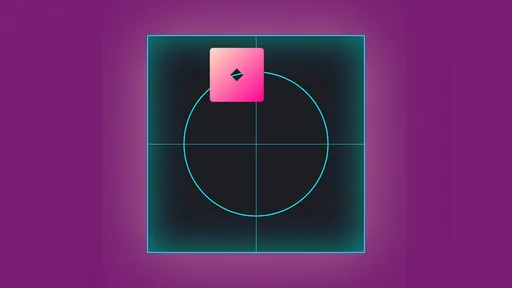
A perfect orbit that would make any celestial body jealous!
:root {
	--o: 100px; /* Determine how far the element will be from its origin */
}

@keyframes floatation {
	/* This operation creates a floating rotation around a center point — the offset guides how far from the center the element is */
	0% {
		transform: rotate(0deg) /* A */ translateX(var(--o)) /* X */ rotate(0deg); /* -A — since A = 0, no need for the minus sign */
	}
	100% {
		transform: rotate(360deg) /* A */ translateX(var(--o)) /* X */ rotate(-360deg); /* -A */
	}
}
Let's break down each transform:
- element is rotated by an angle of
Adegrees - element is moved by an arbitrary offset
X(in this case, atranslateX) - element is rotated again by the opposite angle, so
-A
This chain only moves the element by X, but if you animate the A value in that chain to 360 and -360 respectively… magic happens. That's a little superpower that chained transforms have.
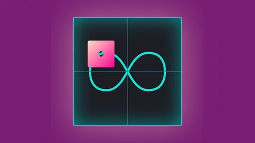
Circles are boring? Well then, to infinity and beyond!*
*wherever custom property declarations are accepted.
A circular orbit is fun but an infinity symbol? That's way more fun!
We can set up some --x and --y properties to independently move our element in the shape of an infinity symbol, and register them with @property. I added a bit of trickery to make it easier for us:
- horizontally, we're going from start to end to start, in a loop,
- vertically, we're going up, down, up, down, and finally up.
We can create two independent animations for this: infX and infY.
:root {
	--o: 100px;
}

.element {
	transform: translate(
		calc(var(--x) - var(--o)),
		calc(var(--y) - var(--o) / 2) /* We'll only need to go half as high/low for this shape as it's *roughly** two circles side-by-side */
	);
	animation: var(--anim-dur, 2s) infinite;
	animation-name: infX, infY;
	animation-timing-function: cubic-bezier(0.3, 0, 0.7, 1), cubic-bezier(0.5, 0, 0.5, 1);
	animation-delay: 0s, calc(var(--anim-dur) * -1.125);
}

@keyframes infX {
	0%,
	100% {
		--x: 0;
	}
	50% {
		--x: calc(2 * var(--o));
	}
}

@keyframes infY {
	0%,
	50%,
	100% {
		--y: 0;
	}
	25%,
	75% {
		--y: var(--o);
	}
}
We are using different easing values to better match the shape of our infinity symbol. Feel free to keep it as ease-in-out for both if you prefer!
Note
This will only work in browsers that support declaring @property, such as Google Chrome
The future
When motion-path becomes widely supported (we are getting there), we can build way more complex animations easily within CSS, which preserve the orientation if needed. Though if you cannot wait, GSAP's MotionPath has you covered!